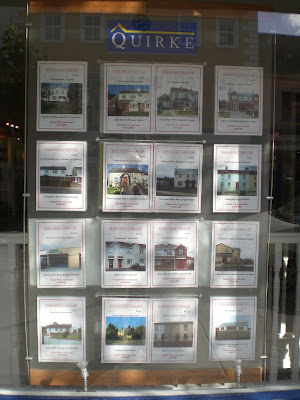
This is our office window.

Until yesterday, the 3 sections were the same.
Details of properties on our headed paper, together with a photo and price.
As the property market has fallen, some prices have reduced by a small amount, some substantially.
These price reductions were put on our front window, but did not seem to generate much interest.

Yesterday, I did the price reduced details in a different format.
Non-branded paper. Large red border. Headline “Substantially reduced”.
We put these in the centre section of the window last night.
It is 4.15pm as I write and already today 19 separate walk-in enquiries have come from the Substantially Reduced section!
Some of them are great value.

Yes that is €75,000 for a cottage!
Simplicity, clarity, singleness works as well in window display as in life.
Good thinking.
ReplyDeleteThanks Ger. Just got to convert the walk-ins to sales and it will be a good September:)
ReplyDeleteAlready had a client ask me "What do I need to do to get on the mid-section?" My reply, "See the Headline, substantially reduce!"